Storytelling with my personal running data
This is just an undocumented of (in my mind) interesting ways to visualize my personal running data.
Calendar view
Monthly aggregate
Cumulative distance & elevation gain
And here is the historic view over the last decade.
Here's the same chart, but for elevation gain.
Here again the historic view.
Distance distribution
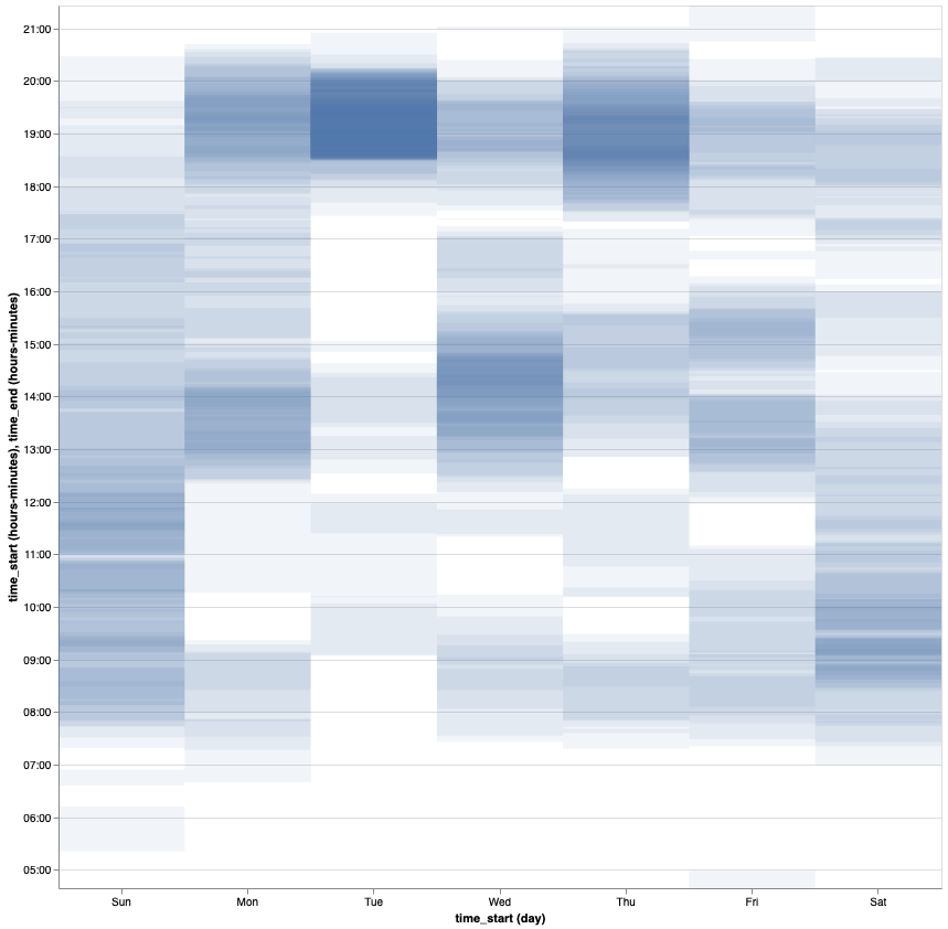
Timetable